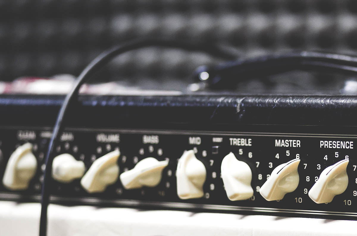
In a small bar or club, the solo singer wants to gain attention from at least some of the happy, chattering nightlife crowd. The answer isn’t to be louder. Being just loud enough (and singing a good song) will tend to quiet the people nearby and “draw them in.”
To be too loud in this setting would most likely be a turn-off.
The designer of a good magazine page knows to keep it wonderful, yet simple. A bright colorful photograph is wonderful, but too many of them – all the same size, are not wonderful. And having white space is a must, if at all possible.
Website design is content design. You want to “draw visitors in” to your content and successfully communicate with them.
If you have some bright colorful photos and designs, that’s wonderful. But also balance that with white space and some “quiet.”
PS. If you are loud performing concert rock band, absolutely none of the above probably applies – for performing or website 🙂

